|
READING
Color
Our ability to see colors is due to photoreceptor pigments in three classes of cone-shaped, color-sensing cells in the retina of the eye.
Color is seen by the human eye as electromagnetic radiation in the wavelength range of between 400 and 700 nanometers (a nanometer is a billionth of a meter).
This range is commonly called the visible light spectrum.
There are differences, however, between color as light and the color of pigment.
Light: Additive Color
Sunlight, or “white” light, is additive color.
The hue or color of light is determined by the distance between the crests of waves in the Electromagnetic Spectrum. Green, for example, is about 500 nanometres between crests, while red is about 700 nanometres.
The brightness of a color is determined by the height of the crest (or energy level) of the wave. Red can be exactly 700 nanometres in wavelength, but will be tonally lighter and brighter when the crest is high (when the light is brighter) and tonally darker when the crest is low.
In the additive color system of light, there is no white or black, only more or less energy.
The primary colors in the additive system are red, blue, and green.
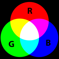
In different combinations, these three colors make other colors and produce the sensation of white when they are mixed in equal parts. These three colors are fundamental to human vision.
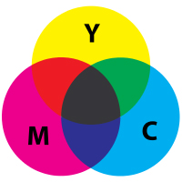
Pigment: Subtractive Color
Pigment (paint or dye), on the other hand, is subtractive color.
Pigment is the color we see on surfaces. When light is incident to a surface, some wavelengths of light are reflected from a surface and some are absorbed.
For example, if we see a surface as red, it is because the surface has absorbed the blue and green light and is reflecting only the red. In effect, the blue and green have been subtracted from the light and absorbed into the red surface.
Pigment, then, is a substance that reflects its own wavelength and absorbs other wavelengths.
The primary colors in the subtractive system of pigment, however, are less easily identified.
When mixed together in various combinations, the primary colors are supposed to produce all other colors.
But the results are not always satisfactory. When Goethe's three primaries are mixed together, for example, they produce not black or white (as in the additive system) but a muddy brown color.
The printing industry uses three primary subtractive colors: cyan, magenta, and yellow.
Color is a basic element we see. It is one of the characteristics of an object; we refer to green grass, a blue sky, or a red balloon.
However, it is not as important as shape because, unlike shape, it can be seen to shift and change under different conditions. Green grass can become brown or yellow without rain.
As long as the shape of an object remains identifiable, though, we can tolerate a variety of color changes. Our objections emerge when we find the color unpleasant or not to our taste. Altered colors bother us much less than altered shapes.
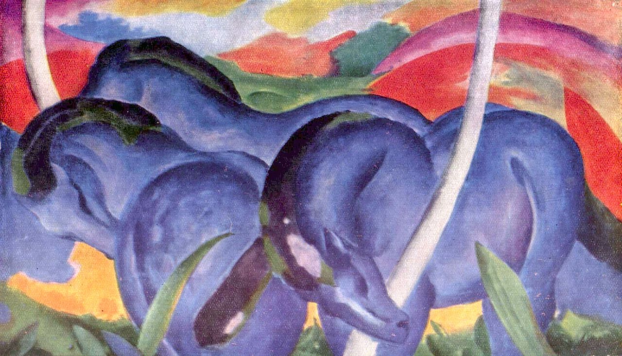
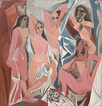
The distorted shapes of the faces and bodies in Picasso's Les Demoiselles d’Avignon have drawn more critical comment than the blue horses and red hillside in the painting by Franz Marc.

In the real world, color exists only in connection with something. It is seen only where light touches an object, or moisture or particles in the atmosphere.
Color is always seen in a context, and this same context may effect the characteristics of the colors seen there.
What we call “red” wine is not red in color, nor is “white” wine white.
Children consistently color the trunks of trees brown, whereas the trunks of most living trees are grey, and they always color the sun yellow even though at different times of the day it ranges from a pallid white to a fiery orange-red.
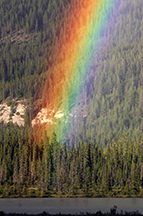
The English physicist and mathematician Sir Isaac Newton (1643-1727) demonstrated that all the colors of the visible spectrum reside in white light. In other words, without light there is no color.
A lot of effort has been devoted to establishing a precise terminology for color. But we must be aware of the fact that no two people are exactly alike in the way they perceive light and identify color.
Moreover, research into the evolution of basic color terms in different languages around the world, shows that the range of terms for colors varies from one culture to another.
An adult human with normal color vision can generally discriminate between 120 and 150 differences in color across the visible spectrum.
This number increases into the millions if we include ranges in saturation and brilliance (for which see below). Today, computers provide us with “millions of colors.”
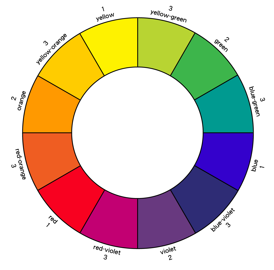
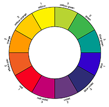
Primary, Secondary, & Tertiary Colors
Red, Yellow and Blue are termed primary colors. They are called primary because they cannot be made by mixing together other colors.
Green is a secondary color, together with orange and violet.
Secondary colors are made by mixing together two of the appropriate primary colors.
These six principal colors were “discovered” by Sir Isaac Newton who showed in experiments that sunlight passing through a prism is broken up and emerges as red, orange, yellow, green, blue, indigo, and violet, arranged in the same order as in a rainbow.
When primary colors are combined with secondary colors, they produce a range of six tertiary colors.
When the primary, secondary, and tertiary colors are arranged in a wheel, colors opposite each other are called complementary colors.
Value and Saturation
The spectrum contains seven clearly identifiable colors, and so we have today, unlike in the past before Newton, a clear sense of the color “red” or the color “blue.”
However, at the same time, the term “blue” also includes every blue from a light ”sky blue” to a dark “navy blue.”
This range from light to dark in a color is called its value.
The blue in the middle of this range we regard as just “blue” and is called the normal value; all the other blues are either lighter or darker than it.
When a hue is lighter than the normal value color, it is called a tint. When it is darker it is called a shade. Navy blue is a shade of blue.
These days, however, the words tint and shade are not used with precision. Instead, the word shade is used generally to describe the full value range of a hue from light to dark.
Artists alter the values of colors by the mixing them with white or black. The hue remains the same, but its lightness or darkness has been changed. If, instead, another lighter or darker color is mixed with it, not only is the value of each color changed, but also its hue; it no longer the same color.
The relative purity of a color is measured by its saturation or intensity. Pure, unmixed colors are said to be of high saturation.
Colors that have been softened by mixing them with white or grey have lower saturation.
Today, digital photography permits adjustments in saturation levels in photographs. The saturation level in the original photograph on the left has been increased by 50%. Notice that the increase in saturation also affects the perceived lightness of the various colors.


|
 ARTH117