|
READING
Composition
Guided by his or her own visual response, the artist manipulates the basic visual elements of color, line & shape, texture & space in order to give form to a subject, theme or idea. The resulting image is a composition.
Composition refers to how all the elements in an image are arranged. The word composition describes both the completed image and the process of making it. The way in which an image has been composed is called style.
Composition is by far the most challenging and most important task the artist undertakes. Indeed, the ability to compose images is fundamental to the definition of an artist. It involves manipulating lines, shapes, colors, texture, and space into desired forms and shapes to produce particular impressions and associations.
The ultimate goal of the artist is the creation of an image in which all the elements visually cohere and make sense as a composition.
The process of composition culminates when all its parts coalesce into a visually coherent and effective image. In artists’ parlance, it is when the image “works.”
The challenge of composition is more complicated because an image is both seen as a whole in an instant and looked at in its details over time. Therefore, it must be composed so that it is immediately visually interesting as a whole and also effective in the visual ordering of its parts.
The goal of composition is to create impressions and associations. When done effectively, a composition can produce or evoke responses in you that are out of all proportion to the elements that compose it. It is the achievement of composition that underlies the mystery and fascination of art.
At the heart of an artist’s ability to compose a visual image is imagination, which, as Aristotle believed, is the place where sense and reason meet. We might think of imagination as the dynamic confluence of visual impressions and mental associations.
The task of the artist, however, is to translate the products of his or her imagination into a visual image. In this the artist is guided by what seems best or pleasing to his or her eye.
The unique visual relationships of a composition are determined by the judgment of the artist’s own sense of what appears visually “right.” In this respect, the process of composition is intuitive (from the Latin intueor meaning to look at or gaze upon).
It is accomplished not by following rules or applying laws, but goes beyond such knowledge. It relies on the artist’s ability to evaluate and discriminate according to his or her own aesthetic sense.
Composing
Composition begins the moment the artist decides to make an image.
Working procedures may differ, but usually an artist will make sketches and drawings to work out the best pose for a figure or to explore the fall of light and shade over a surface. In his drawing for a Madonna and Child with a bowl of fruit, Leonardo da Vinci sketched out different positions for the child’s legs as he tried to find the most satisfactory arrangement.
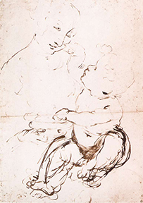
Leonardo da Vinci, Madonna and Child with a bowl of fruit, 1470s (Musée du Louvre, Paris)
Another drawing shows Leonardo studying the patterns of light and shade on the dress like the one he planned to use for the Virgin in his painting of the Annunciation.
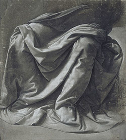 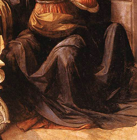
Leonardo da Vinci, Annunciation and Drapery Study
Left: drawing, c. 1472 (Musée du Louvre, Paris)
Right: painting, 1472–75 (Galleria degli Uffizi, Florence)
From the poses of individual figures, the artist may work up compositional drawings of groups of figures, sometimes, as in the case of a compositional drawing by Raphael for his fresco of the Disputà, posing the figures in the nude so that their postures could be more clearly articulated. Several changes were made to the composition between the drawing and the final fresco.
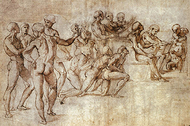 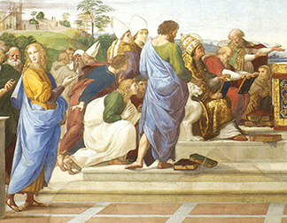
Raphael, Compositional Drawing for the lower left portion of the Disputà
Left: Drawing: c. 1508 (Städelsches Institut, Frankfurt)
Painting (detail): 1509, Stanza della Segnatura, Vatican
Towards the end of the compositional process, a fresco painter would produce a final full–size drawing, called a cartoon, that would be transferred to the surface of the wall.
Besides drawings, a painter may also make painted sketches (sometimes called bozzetti) in order to work out the final details of a composition before embarking on the final painting.
A sculptor, on the other hand, in addition to sketches and drawings, may also make small-scale models out of clay or wax (called maquettes).
Gianlorenzo Bernini, for example, made numerous models in clay for his sculptures, such as the Angel with the Superscription. By the time he carved the final version in marble, he had made several alterations to the design, especially in the drapery and position of the head.
����������������������������������������������������������������������������������������������������������
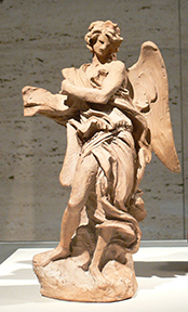 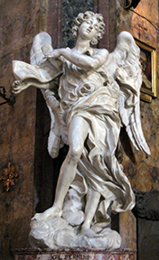
Gianlorenzo Bernini, Angel with the Superscription
�Left: clay model.1667-68 (Fogg Art Museum, Cambridge, Massachusetts)
Right: marble sculpture.1667–68 formerly Ponte Sant’Angelo, Rome (now located in S. Andrea delle Fratte, Rome)�
The composition of a painting or other two–dimensional work will often be organized or arranged in relation to the overall two–dimensional surface of the support.
This surface is usually delimited by the edges of the canvas or panel or may be otherwise defined by some sort of frame. An artist will use the shape and dimensions of the framed space as the basis for a composition’s structure.
The seventeenth–century landscape painter Claude Lorraine employed a system of vertical and horizontal divisions to organize the composition of his Seaport: The Embarkation of St. Ursula.
����������������������������������������������������������������������������������������������������������
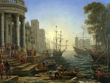
Claude Lorrain, Seaport: The Embarkation of St. Ursula, 1641 (National Gallery, London) and compositional structure
The horizon line is established at two–fifths the height of the canvas. The main mast of the central ship is placed in the middle of the composition. The left edge of the square tower is aligned a quarter in from the left, while the main mast of the ship in front of the castle on the right is aligned a quarter in from the right.
In his large altarpiece of The Baptism of Christ, Piero della Francesca aligned the dove of the Holy Spirit and the figure of Christ along the central vertical axis of the painting (the green line).
����������������������������������������������������������������������������������������������������������
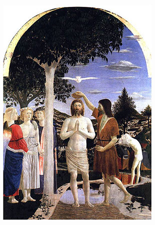 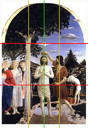
Piero della Francesca, Baptism of Christ c. 1450 (National Gallery, London)
and compositional structure
Piero also divided the surface into thirds both vertically (the yellow lines) and horizontally (the red lines) and arranged the primary elements of the composition within this structural format.
Besides verticals and horizontals, an artist might organize the composition in relation to diagonal lines. A line drawn from the top left corner to the bottom right corner of François Gérard’s portrait of Madame Récamier shows immediately that the figure was placed so as to occupy only the left-side triangle of space.
����������������������������������������������������������������������������������������������������������
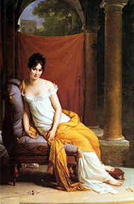 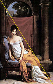
François Gérard, Madame Récamier,1802 (Musée Carnavalet, Paris)
The most difficult compositional task an artist undertakes is the resolution between the two–dimensional design of a painting’s surface and the three–dimensional space of the picture. In his painting of the ��Martyrdom of St. Sebastian, Antonio del Pollaiuolo placed four bowmen in the foreground space, behind them a tree trunk to which St. Sebastian has been tied, and two more bowman beyond the tree trunk.
����������������������������������������������������������������������������������������������������������
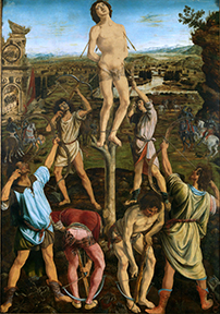
Antonio and Piero del Pollaiuolo, Martyrdom of St. Sebastian, 1475 (National Gallery, London)
The challenge for Pollaiuolo was to compose his figures realistically within the space or depth of the picture, but also to arrange them so that they formed a satisfactory design on the two–dimensional surface of the painting.
Although St. Sebastian and the bowmen occupy spatial positions distant from the figures in the foreground, Pollaiuolo has cleverly arranged them so that on the surface of the painting the entire group fits into a neat triangular configuration.
You will notice that your position as the viewer of this scene is not on the same level as that of the bowmen in the foreground.
In this position, Pollaiuolo had much greater flexibility in composing his figures: he could arrange them both within the depth of the picture and on the surface of the painting.
The two bowmen at the rear in the space of the painting have been placed above the foreground figures on the surface of the picture.
If Pollaiuolo had composed the scene so that it was viewed as if you, the viewer, were standing on the same ground at eye level with the bowmen in the foreground, the two bowmen in the background would be obscured.
Judgment
To a certain extent, composition involves making compromises between the artist’s original idea or intention, the medium selected, the subject matter or theme, the physical location or context of the completed work, and the demands and expectations of the person or people paying for and/or viewing the final product.
The most delicate compromise an artist makes, however, is that between representation and “art.” In other words, as much as an artist is representing something in an image, he or she is also concerned with making an “artistic” image. In order to accomplish this, it is usually necessary to make artistic adjustments to what is being represented.
In David Hockney’s double portrait of Celia Birtwell and Ossie Clark (and their cat Percy), photographs taken by the artist himself while preparing the composition permit us to see what adjustments he made in the final painting.
In a photograph of Mr. Clark and the cat, which has been squared up for enlargement and transfer to the canvas, Hockney has made some obvious adjustments. How many can you spot?
����������������������������������������������������������������������������������������������������������
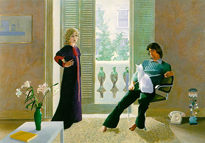
David Hockney, Mr. and Mrs. Clark and Percy, 1970-71 (Tate Gallery, London)
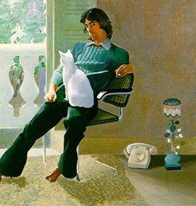 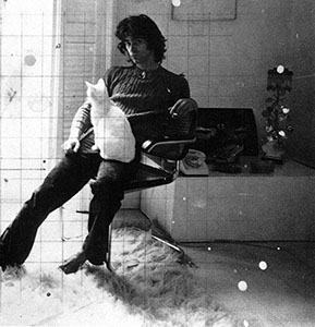
David Hockney, detail of Mr. and Mrs. Clark and Percy, and a photograph of Ossie Clark and Percy
Immediately noticeable is the removal of the items on the right except for the telephone and lamp, which have been placed on the floor. The shag rug on the floor has been extended, and the chair has been moved more to the left and back closer to the wall.
In the painting, the vertical line of the wall and shutter is aligned with Mr. Clark’s head rather than with his right shoulder. The collar on Mr. Clark’s shirt has been altered, and his unruly hair tidied up somewhat.
Hockney made these adjustments in order to make the painting look better. His aim was to create an image that achieved a satisfying visual coherence. Through his manipulation of colors, lines, shapes, textures, and space, Hockney deliberately strove to produce a composition that satisfied his own artistic sensibility and taste. No doubt it was his hope that what he found artistically satisfying would also be a pleasurable viewing sensation for others.
A composition may be adjusted for aesthetic or expressive reasons, or simply in order to make it more visually effective or interesting.
Whatever the case, the artist relies on the judgment of his or her own senses. The artist’s goal is to produce a composition he or she likes or is pleased with. Until this point is reached, the image is regarded as incomplete or unsatisfactory. In the process of composing an image, an artist exercises his or her artistic skills and knowledge. At the first and most important level, it is an aesthetic response to the presentation of colors, lines, shapes, textures, and space in the composition. Additional pleasure, of a more intellectual kind, may be derived from the artist’s treatment of the subject matter or theme.
Principles of Composition
- Unity and Variety
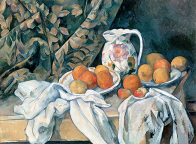
Unity in an image is both the visual and conceptual sense of all the parts of the image forming a complete and coherent whole. A sense of unity can be achieved through the manipulation of any one, or more than one, of the Visual Elements.
Controlled repetition of the basic visual elements of color, line & shape, texture & space can visually unify an image.
Variety is introduced into a unified image to create visual interest.
Paul Cézanne’s Still Life with a Curtain (1895) has both unity and variety
- Balance
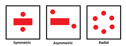
Balance is an equilibrium of forces in terms of weight, quantity, or emphasis. Balance can be developed in relation to the left and right sides of an actual or implied axis, or it can radiate from an actual or implied central point. Balance is achieved by adjusting the “visual weight” of the forms of the design or composition.
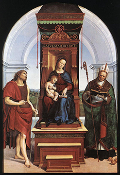
- Symmetrical Balance has similar or identical elements arranged on either side of the central axis. The design or composition may appear as in two halves, with visual elements arranged either side of an imaginary vertical dividing line running down the centre.
- Asymmetrical Balance is when an equilibrium is attained among elements dissimilar in size or shape.
- Radial Balance is when an equilibrium is attained among elements radiating around a central point.
- Emphasis and Focal Point
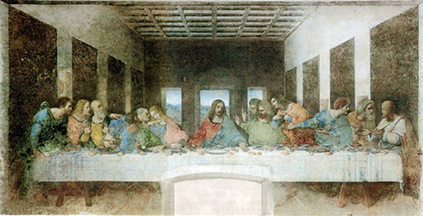
- Emphasis is the means by which the viewer's attention will be attracted to a certain part or parts of the design or composition.
- Focal point refers to a specific spot in a painting towards which the artist or image-making is deliberately directing out attention.
Emphasis and focal point can be created by manipulating various elements of the design or composition, such as light or color, but also through spatial construction, or the gestures of figures, or the implied movements of objects.
- Proportion and Scale
Proportion and scale both concern the size of elements (objects, forms) in a design or composition.������������������������������������������������������������������������������������������������������������������������������������������������������������������������������������������������������������������������
- Rhythm
Rhythm is found in all aspects of life, and it is often perceived or felt in the visual arts. In one sense, rhythm, as an aspect of harmony, lies at the root of proportion.
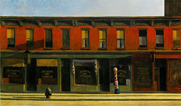
Visual rhythm is usually seen in the repetition of accented forms or shapes or lines. This rhythm can be “fast” or “slow”. A series of rhythmical impulses move horizontally across Edward Hopper's painting Early Sunday Morning:
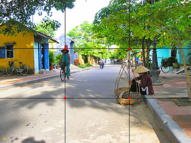
Rule of Thirds (guideline in photography)�
The Rule of Thirds states: “Whenever appropriate, place your subject at one third distance from the edges of your frame”


Commercial Imagery �

|