trompe l'oeil. If an image strikes us as a convincing representation of the real world, we call it realistic or naturalistic.
Although the image that appears on the retina of our eyes is two-dimensional, we nonetheless perceive the world as a three-dimensional place.
It has height and width and also depth (or distance).
The challenge for the artist working on a two-dimensional surface such as a wall or canvas has been to devise ways in which to create images that appear to be three-dimensional and which occupy three-dimensional space.
Over the centuries, artists have developed various devices which, for the most part, are the result of careful observation of the way the human eye perceives three-dimensional form, depth, and space in the real world.
When re-created on a two-dimensional surface, our eyes are fooled or tricked into perceiving the figures and objects and space as three-dimensional.
Not all artists at all times, however, have wanted to produce images that realistically reproduce the three-dimensional world in which we live.
During the European Middle Ages, when much art was produced in the service of the Catholic church, the emphasis in image-making was placed not on producing a semblance of the natural world but on more spiritual matters.
Images were not required to be realistic, nor was realism, with its necessary attention to the features of the physical world, even desirable.
Space and depth in medieval images is of secondary importance.
The realistic representation of space was also of little interest to artists in the ancient world before the 5th century BCE.
In the 20th-century, a number of artists have deliberately rejected three-dimensional space in their work.
A sense of three-dimensional space and depth, or distance, can be created in an image employing the following devices:
- diminution
- overlapping
- atmospheric perspective
- linear perspective
In addition, these effects can be further enhanced using foreshortening and repoussoir devices. In the natural world, objects, animals, and humans are distributed in the space around us so that some may appear near to us and others farther away.
For various obvious reasons, it is useful to know where things are in their spatial relationship to you.
But, before you can determine how far away something is, you need to know its three-dimensional mass or size.
For humans, perceiving size and judging distance can be accomplished only through object identification and context.
We rely on various circumstantial cues for comparison to give us an idea about how far away something is.
When no visual cues are present, we have a lot of difficulty judging size and distance.
Experiments reveal that when an object is viewed in an otherwise featureless visual field, we begin to underestimate its true size after it is more than only an arm's length away!
The greater the distance, the more we underestimate.
When a full visual context is available, adult humans can usually judge the size of objects up to 100 feet away.
Children, in contrast, do not have this ability and their judgements of size are inaccurate when objects are more than only 10 feet away.
It would appear that our ability to perceive size and distance develops as we mature into adults.
Children see the world differently to adults, something we are reminded of when we return as adults to a childhood place and find it much smaller than we perceived it as a child.
Diminution Most of the time we are unaware of how we adjust for distance in viewing the size of objects.
Objects seen at even a short distance away are smaller in size, but we automatically compensate and see them as "normal" sized.
In the photograph by Robert Doisneau, the painter working at his easel appears as a normal-sized man.
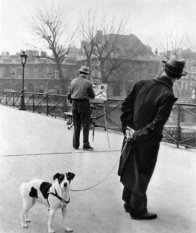
When the same-sized figure is placed in the foreground next to the man with the dog, however, he is seen to be much smaller. Indeed, even though we know it is the same figure, the man in the middleground of the image still appears larger than his 'double' in the foreground!
The lamp post in the background, which also appears normal-sized, when placed in the foreground is only as tall as the dog.
The important point is that the smaller size indicates that the painter is farther away from us than the man in the foreground, and that the lamp post is even farther away.
This visual phenomenon, in which figures and objects appear smaller the farther they are away from us, has been utilized by artists over the centuries to create an illusionary sense of depth or distance.
To describe where people and objects are located in the space before us we use the terms:
- foreground
- middleground
- background
The man with the dog is in the foreground nearest to us. The lamp post and the buildings beyond are located in the background, far away from us. In between, in the middleground, is the painter at his easel.
Robert Doisneau's photograph shows that changes in size due to distance from the eye occurs naturally in the way humans see.
Painters have utilized this phenomenon as a device to create a sense of depth or distance.
On the right in his painting, Piero della Francesca has placed three large figures and on the left a group of much smaller figures in a scene of the flagellation of Christ.
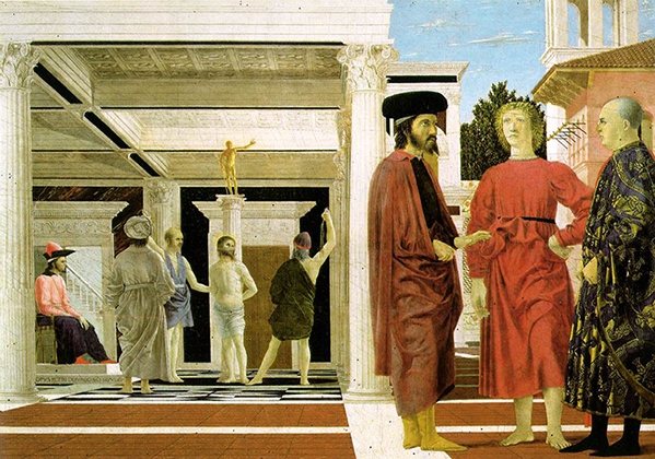
The relative size of the figures is made more obvious when one of the figures on the left is placed with the figures on the right.
The effect is that we perceive the three figures on the right as standing in the foreground near to us, and the scene of the flagellation as taking place farther away from us in the background.
Other devices, such as Piero's use of perspective (see below), have contributed to creating this sense of depth, but making figures and objects smaller, also called diminution, has long served as an effective means of creating an illusion of depth.
The illusion of depth created through diminution is further enhanced if the objects, as they are made smaller, are also placed higher on the picture plane.
In Robert Doisneau's photograph, the man painting is located higher up than the man with the dog, and the lamp post higher still.
Similarly, the flagellation group in Piero della Francesca's painting is placed at a higher level than the three figures on the right.
The height of the object in the field of the image, however, is not always a reliable cue to perceiving distance.
In the case of the Doisneau's photograph and Piero's painting, the placement is effective because it is combined with other visual cues, notably the perspective system employed by Piero and the strong diagonals of the bridge and railing which converge and diminish in the photograph.
Overlapping Overlapping, or interposition, is the placement of a figure or an object so that it is partly concealed behind another.
The arrangement creates the impression that the figure or object behind the one in front must be farther back in space.
Unless other space-creating devices are also employed, the sense of space is dependent entirely on the perceived three-dimensionality of the overlapping objects.
Space, or depth, extends only as far as the figures or objects themselves.
A second row of figures appear as if standing behind the figures lined up in the foreground of the Ara Pacis Augustae relief.
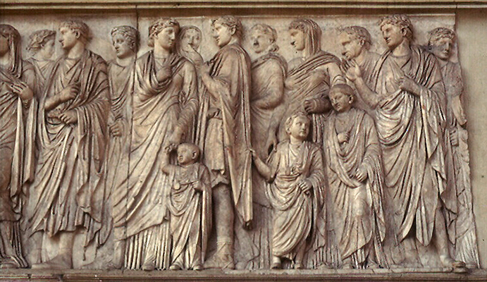
In contrast to the foreground figures, the figures behind are also carved in shallower relief, which adds to the effect that they stand a little farther back in space.
The impression is enhanced by our knowledge that humans are three-dimensional, and so we think of the space in the relief as being at least two persons deep.
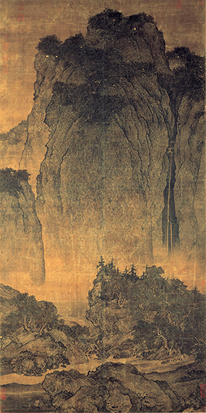
In the landscape painting by Fan Kuan, the rocks in the foreground partially hide the road beyond them, while the rugged hills beyond the road in the middleground overlap the mountains in the background, causing them to appear farther away.
In some cases, a sense of space due to overlapping is incidental and it was not necessarily the original intention of the artist.
In the Hall of the Bulls at Lascaux, a small dark horse slightly overlaps a larger brown horse which in turn overlaps a partially drawn bull.
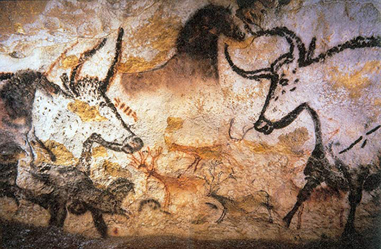
It is a natural impulse to see the bull as "behind" the horse, and the black horse as "in front" of both.
However, it was not the intention of the artist to create any sense of space.
In fact, the bull, the brown horse, and the small horses were painted at different times, probably by different artists. Each artists simply painted over the top of the earlier image.
An important clue to the lack of a spatial relationship between the animals is the lack of a recognizable ground line or plane that would unite them in a continuous space.
Atmospheric Perspective One of the ways humans judge distance is by comparing size.
If a normal-sized object or a person appears small, we conclude it must be far away from us.
In fact, the smaller it appears, the farther away it must be. Another important clue for judging distance is colour and distinctness.
When seen close at hand, objects are in sharp focus and can be seen in detail.
When viewed at a distance, however, they appear blurry and unclear, their outlines are less distinct, details less sharp or cannot be discerned at all, and the colour saturation and range is reduced.
As distance from the observer increases, colours are gradually reduced to a bluish tinge.
The phenomenon is caused by the atmosphere.
Between the object we see and our eyes is air. As light, which is carrying the image of the object to our eyes, passes through the air it becomes scattered by air particles.
The more air between the object and our eyes, the more light is scattered. Long wavelengths of light are scattered more than short wavelengths.
This means that long wavelength colours at the "red" end of the spectrum are scattered and lost more than short wavelength colours at the "blue" end of the spectrum.
This is why more distant objects appear blue.
The mountains in Albert Bierstadt's landscape painting appear to be off in the distance because of the hazy, bluish tone he has given them.
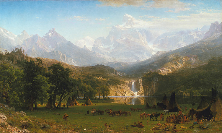
Another factor contributing to the perception of distance is texture.
As the plane of the ground recedes into depth, the texture gradient declines.
This feature was also employed by artists to increase the illusion of depth.
In the painting of St. Christopher Carrying the Christ Child, attributed to Dieric Bouts, the clear textural definition of the waves of water in the foreground is gradually decreased so that the plane of the water appears to be receding into depth.
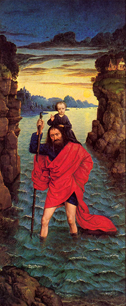
The term atmospheric perspective (also called aerial perspective) was first used by Leonardo da Vinci in the 16th century.
Linear Perspective Another odd feature of human perception is that when we look down a railroad track leading off into the distance, the two rails of the track appear to steadily converge the farther away they get.
Although we know the rails are a constant width along the track's length and remain parallel, visually the tracks appears to get progressively narrower until they converge completely at a point on the horizon.
In Dorothea Lange's photograph, the parallel edges of the road converge towards the horizon.
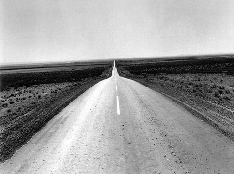
The principles on linear perspective, however, were first described in the 15th century by Leon Battista Alberti (1404-1472).
The system involves establishing a horizontal horizon line and locating on it a vanishing point.
Straight lines, called orthogonals, are then made to converge on the vanishing point.
The next step involves drawing a series of horizontal lines parallel to the horizon line called transversals.
The placement of the transversal lines requires making a calculation derived from measurements taken from a real or hypothetical distance point.
The distance or interval between one transversal line and the next decreases as they near the horizon line.
One or more diagonal lines drawn from the distance point across the orthogonal lines indicated, at the point of intersection, the placement of each transversal line.
The intersecting orthogonals and transversals form a grid pattern, but a grid seen in perspective.
Each square comprising the grid is ostensibly the same size, but their shape is distorted into a trapezoid by the perspective (approximating how it would be seen in real life)
The squares also get smaller as the lines converge on the vanishing point.
Because each square of the perspective grid is ostensibly the "same" size, space can be artificially measured in depth.
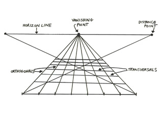
Linear perspective enabled artists to calculate the degree of decrease in size as an object as its recedes in space. When applied to a two-dimensional surface, the artist is able to trick the eye by creating an illusion of an object receding three-dimensionally into depth.
In a preparatory study for the background in the upper portion of his (unfinished) painting of the Adoration of the Magi, Leonardo da Vinci first drew a perspective grid composed of orthogonal lines and many horizontal transversal lines.
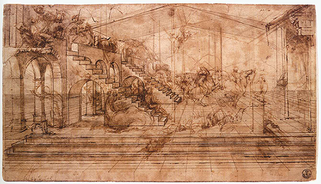
The closely-spaced transversals stop short of the vanishing point and horizon line.
Leonardo then used this grid to organize the placement of figures, horses, camels, and buildings.
The building on the left is placed using the receding orthogonal lines as a guide.
The transversal lines permit Leonardo to calculate precisely the appropriate relative size and degree of diminution of the series of arched openings and the two open staircases.
The use of linear perspective as a guide to the precise foreshortening of objects and architecture in space is a European preoccupation.