|
READING
Seeing & Impressions
Seeing
There is a distinction between seeing and looking. Humans have what is essentially a dual visual system, a combination of low-resolution seeing and high-resolution looking.
Scientists distinguish between the ambient vision of seeing and the focal vision of looking. Although it is generally the case that you see and look at the same time, your response to visual stimuli occurs in two stages.
The first stage occurs the instant an image comes into view. Your first glimpse of the painting The Unexpected Visitor by the 19th-century Russian artist Ilya Efimovich Repin provides you with an overall or ‘global’ impression.
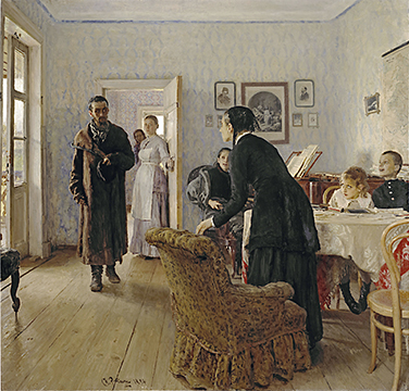
Ilya Repin, The Unexpected Visitor, between 1884 and 1888
What you see in this very first glimpse are contrasting areas of lightness (brightness) and darkness, lines forming the edges of shapes, and colors.
Your eyes see these features because your brain is cued to respond to them. It is important to realize that although you are hardly conscious of this first level of visual information gathering, it is nonetheless an essential part of your visual experience. It establishes your (first) impressions of the image and contributes to the image’s meaningfulness.
Impressions
In the first glimpse of an image you form an impression of it. Impressions are an immediate and direct response to the visual sensations created by what you see. Your ‘first’ impression may be modified upon further examination of the image, but generally it remains valid in subsequent viewings.
Because the eye sees only light, your first visual sensation is of brightness and color. Brightness is a measure of the physical intensity of light entering the eye. Although this physical intensity can be measured scientifically (with various types of photometers, including the exposure meter used by photographers), brightness is a sensation you experience that is only roughly related to light’s actual physical intensity.
An image may be uniformly light, but usually there are areas that are bright and other areas that are less bright. It is the contrast between these areas that is vital for the perception of form or shape (see below). Brightness is a quality of light. Lightness is a dimension of color (also called value).
As was noted previously, the human eye sees color as electromagnetic radiation in the wavelength range of between 380 and 750 nanometers. This range is commonly called the visible light spectrum.

Visible Light Spectrum
This light, however, must be of a particular intensity. The cones in the retina, which provide us with color vision, only respond to ‘normal’ light (daylight and bright artificial illumination). If the light is too bright, the image is visually ‘washed-out’.
On the other hand, if the light is too dim, the cones cease to function and the rods in the retina provide us only with shades of gray.
Brightness and color are purely psychological properties of our visual experience.
Contrasts in brightness and differences in color enable us to see other features of the physical world, such as lines and edges, shapes, and also textures, and space. Of the two, contrasts in brightness are by far the most important.
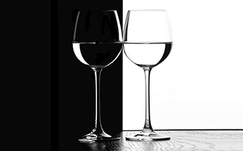
Color is useful but not essential; we can happily watch an old movie in ‘black-and-white’ (actually, shades of gray). But without contrasts in brightness the visible world would lose all definition. We perceive lines and edges in terms of contrast in brightness or differences in color.
We see a line because it is lighter or darker or a different color than the surface on which it appears, and we see an edge as a juncture between a light area and a dark area or between one color and another. These areas are also seen as shapes.
Your first impression of Nicolas Poussin’s painting Funeral of Phocion is in terms of color and brightness.

Nicolas Poussin, Funeral of Phocion, 1648
You notice that the bright, white shape in the center foreground that first attracted your visual attention is especially visually prominent, and which has been additionally enhanced by the sharp contrast between the white and the dark area above it. Other areas of brightness and color contrast also catch the eye.
You are also aware of lines, edges, and shapes in the painting.
In addition to brightness, color, lines, edges, and shapes, two other impressions should be included among the basic visual elements: texture and space.
Although texture and space involve some mental processing, they do play an important role in catching your visual attention and contribute to your initial visual sensations. The perception of both texture and space are dependent on the other basic visual elements.
However, as in the case with lines and edges, which, in the physical world, are often three-dimensional, their existence can be confirmed through the sense of touch.
Texture is primarily a tactile sensation. In this respect, the perception of both actual texture and the illusion of texture is a function of association. However, lines or surfaces can be perceived as textured and the differences in texture can serve to distinguish one area from another. Both for this reason and as a basic quality of a surface, texture is a visual sensation that can make an immediate impression.
The perception of space is dependent on brightness and color but also on lines and, to a lesser extent, texture. Space can be thought of as emptiness but usually it is perceived in relation to the physical objects that we see in it.
The perception of space is the product of a complex series of calculations the brain makes. Despite this, however, space (or the lack of it) can be immediately perceived and produces an immediate visual impression.
Brightness, color, lines, edges, shapes,
texture & space
Brightness, color, lines, edges, shapes, texture and space comprise the basic visual elements that form your initial visual impression of an image. They act directly on your visual apparatus and are processed without any intermediary conscious thought. In other words, they produce responses that your brain registers in purely perceptual terms without the combination of other sensory or mental data.
At least, for the sake of convenience, this is how you might think of impressions. In reality, impressions are more than thoughtless ‘gut’ (i.e. not cerebral) responses to the basic visual elements. They are ultimately grounded in built-in neurological functions already existent in your brain and they function as part of a deeply rooted system of associations.
Brightness and color, lines, edges, shapes, texture and space affect how you see and look at an image. They can also influence your emotional response to what you are seeing.
Before you even begin to look at an image, and long before you have identified its subject matter, the basic visual elements have produced responses in you, perhaps even without you being fully aware of it.
Each of the basic visual elements can create a particular impression, but are usually composed by the artist so they function together. When impressions are emphasized, they are described as expressive.
In most cases, the intent of the artist (and the expectation of the viewer) is to shift visual attention quickly from impressions to associations. However, since the 19th century, it has been the desire of a number of artists to focus the visual experience of the viewer on the initial visual impression.
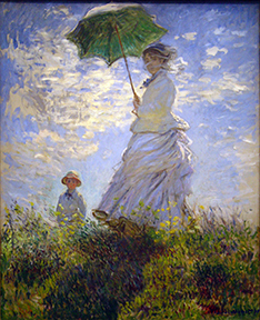
Most obvious in this regard are the aptly named Impressionists who sought to paint what the eye sees. Claude Monet’s Woman with a Parasol, for example, is painted mostly in terms of brightness, color, lines, edges, shapes, texture, and space.
In the early twentieth century, the Expressionist painters, such as Franz Marc, further emphasized the initial visual impression.
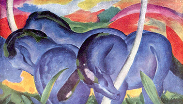
While gazing at Marc’s painting, in fact, you are consciously aware of the shift from impressions to associations, from the initial perception dominated by color and brightness to an identification of the blue shapes as horses.
A desire to focus the viewer’s attention solely on impressions underpins much abstract or non-representational art in the twentieth century. By eliminating recognizable subject matter (and its obvious associations) the viewer is forced to respond to impressions alone.
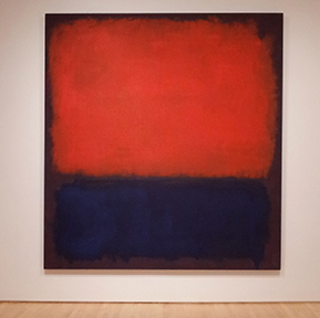
The Abstract Expressionist painter Mark Rothko, for example, focuses on the manipulation of the basic visual elements to produce complex visual sensations.
Rothko himself explained that his paintings were abstract in order to eliminate the “finite associations” we make with familiar things (Possibilities, I, New York, 1947, page 84). He thought of his paintings as dramas expressing basic human emotions, which he conveyed at the level of impressions in purely formal terms.
Impressions (or expressive qualities) and the Basic Visual Elements
 Brightness Brightness
Brightness or value refers to a range of lightness (high value) or darkness (low value) in a color, in an area or region, or in the image as a whole.
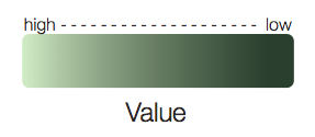
When a pattern of high values is close in range, it can create an impression of lightness, as in Monet’s Woman with a Parasol.
In contrast, a pattern of low values close in range produces a more somber mood. A stronger emotional response is evoked when low values and high values are abruptly contrasted.
 Color Color
Color produces the most profound impressions. The value (lightness or darkness) and intensity (purity or brilliance) of color can stimulate immediate mental and physical responses.
Color is very effective in communicating feelings and is the most expressive or emotive of the basic visual elements. Recent research shows that colors can affect behavior and state of mind.
Red light, for example, is exciting and promotes increased physical activity. Red can also generate feelings of love, anger, or anxiety.
A specific shade of pink can suppress the appetite, while blue light has a calming or depressive affect.
Yellow is described as ‘cheerful’ or ‘lively’ and the performance of schoolchildren seems to improve when their surroundings are colored yellow.
Green, on the other hand, is ‘restful’.
Colors are also perceived in terms of temperature, being ‘warm’ or ‘cool’, and whether they ‘advance’ or ‘recede’.
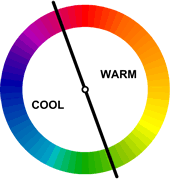
Blue is perceived as a cold, ‘receding’ color.
Red, on the other hand, is perceived as a warm, ‘advancing’ color.
Light, warm, and bright colors generally induce a sense of lightness and uplift.
Dark, cold, and dull colors have the opposite effect.
 Lines Lines
Lines of different types produce different impressions.
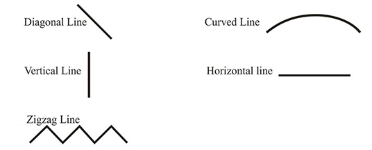
Many of these impressions, however, probably originated long ago through associations with physical elements in the natural world.
Straight vertical lines produce an impression of uprightness and stability. They can also imply height and vertical movement.
In contrast, straight horizontal lines create impressions of flatness. They can also imply lateral space and a passive state.
Diagonal lines produce an impression of diagonal movement or motion. Often, this impression of movement is away from the observer. In linear perspective, diagonal lines are used to contribute to an illusion of three-dimensional space by creating a sense of movement into depth.
The Russian painter Wassily Kandinsky believed that lines also differ from each other by temperature (Point and Line to Plane, New York: Dover Publications, 1979; originally published as Punkt und Linie zu Fläche in 1926).
Horizontal lines are cold and vertical lines are warm. For Kandinsky, horizontal lines were the most concise form of the potentiality for endless cold movement, while vertical lines the most concise form of the potentiality for endless warm movement. Diagonal lines combined both cold and warm.
Curved lines can suggest steadily paced movement, such as ripples on the surface of water, or, in the case of a spiraling line, of movement turning in on itself, such as a breaking wave on a beach.
Uniform horizontal wave-like lines alternate a pattern of tension and release, of positive and negative, and active and passive pressures. When oriented vertically, a wave-like line appears weak and unstable.
An undulating horizontal line can be perceived as graceful and peaceful, while horizontal zigzag lines convey agitation and alarm. Vertical zigzag lines produce an impression of sharpness and speed, no doubt derived from seeing lightning flashing to earth.
The painter and printmaker William Hogarth believed that a wavy or serpentine line was the most “productive of beauty”. He called it the “line of grace” or the “line of beauty” and claimed that the serpentine line had “the power of super-adding grace to beauty”. (The Analysis of Beauty, London, 1753, page 72).
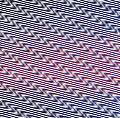
When wavy lines are placed together they can produce kinetic optical effects.
The British artist Bridget Riley explored these optical effects in numerous paintings using a style known as Op Art (‘optical art’). In her painting Cataract 3 (1966), the visual impression is one of rippling movement that can quickly produce a feeling of dizziness.
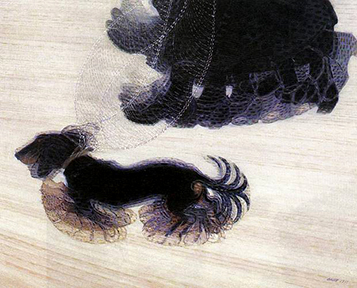
The Italian Futurist artist Giacomo Balla used repetitions of curved lines to create a sense of motion in his painting Dynamism of a Dog on a Leash (1912) showing a dog being taken for a walk.
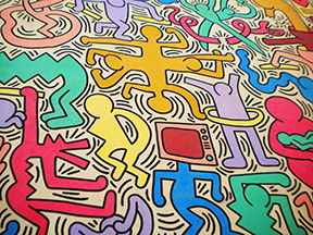
Cartoonists frequently use lines to indicate movement. The graffiti artist Keith Haring employs these same devices in his work, such as this Tuttomondo (1989).
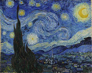
Similarly, Vincent van Gogh created an impression of pulsing or glowing light through the use of short curving brush strokes arranged around the moon and the stars in the sky in his painting Starry Night.
 Shapes Shapes
Lines frequently denote edges and edges can define shapes. Different shapes elicit different responses.
Geometrical shapes, such as squares, triangles, and rectangles, suggest structure, measure, permanence, and stability to varying degrees.

The pyramids at Giza in Egypt, which are comprised of four slanted triangular shapes on a square base, are inherently stable.
Circles are visually stable forms, but ovals are less so. Most organic or curvilinear shapes suggest mutability, instability, change, and variety.
 Texture Texture
Textures can be seen with the eye, but they acquire real meaning only through the sense of touch. Textures and the emotions they elicit are therefore mostly based on associations.
However, various textures (smooth, rough, dry, soft, leathery, scaly, etc) seem to produce immediate impressions that affect the emotions in terms of attractiveness or repulsion.
 Space Space
Space can produce profound psychological effects. At the extremes are people who suffer from claustrophobia (fear of confined spaces), and those with agoraphobia (fear of open spaces, among other things).
Generally, though, the average person will experience small spaces as limited and confining, and large spaces as expansive and open.
However, small spaces can also appear intimate or cozy, while open space can convey a sense of emptiness or a feeling of isolation and alienation.
|